01The challenge
The Foundation’s website had grown the way institutional websites do: one page, one program, one campaign at a time, over years, without a strategy for the sitemap as a whole. A comprehensive audit of internal and external users confirmed what we suspected and quantified how bad it had gotten: people couldn’t find what they were looking for without resorting to search, and the pages they wanted typically sat 5 to 6 clicks deep. The site had everything. It just couldn’t show anyone.
The cost wasn’t abstract. Donors had strikingly low awareness of the many ways to give beyond a simple donation, and those overlooked options, donor-advised funds, stock, real estate, planned gifts, are precisely the gift types that tend to be far larger. A navigation problem was quietly capping fundraising.
Fixing it required more than a web project. It required digital leadership to step in, look at the entire experience holistically, and direct the process end to end. That was me.
02The strategy
I directed a Foundation-wide process, not a redesign ticket: a large-scale, multi-workstream project spanning executive stakeholders, internal teams, and our web agency. We ran internal and external workshops to settle the decisions that actually shape a website: naming conventions donors understand, the organizational structure of navigation and content, and explicit alignment between the information architecture and the Foundation’s fundraising goals, including raising the visibility of Ways to Give and event pages. Leadership across the Foundation was in the room for those calls, and I was accountable for driving them to decisions.
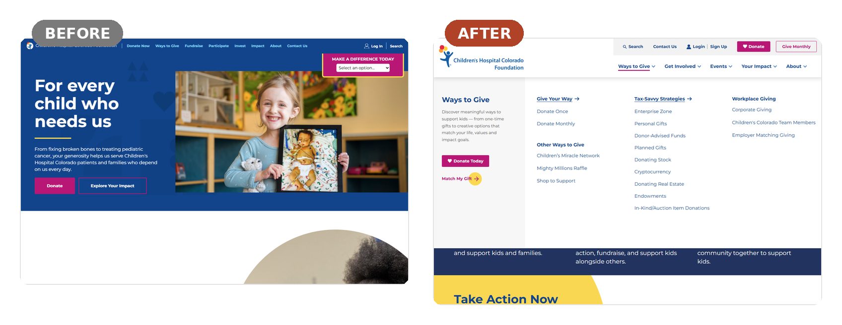
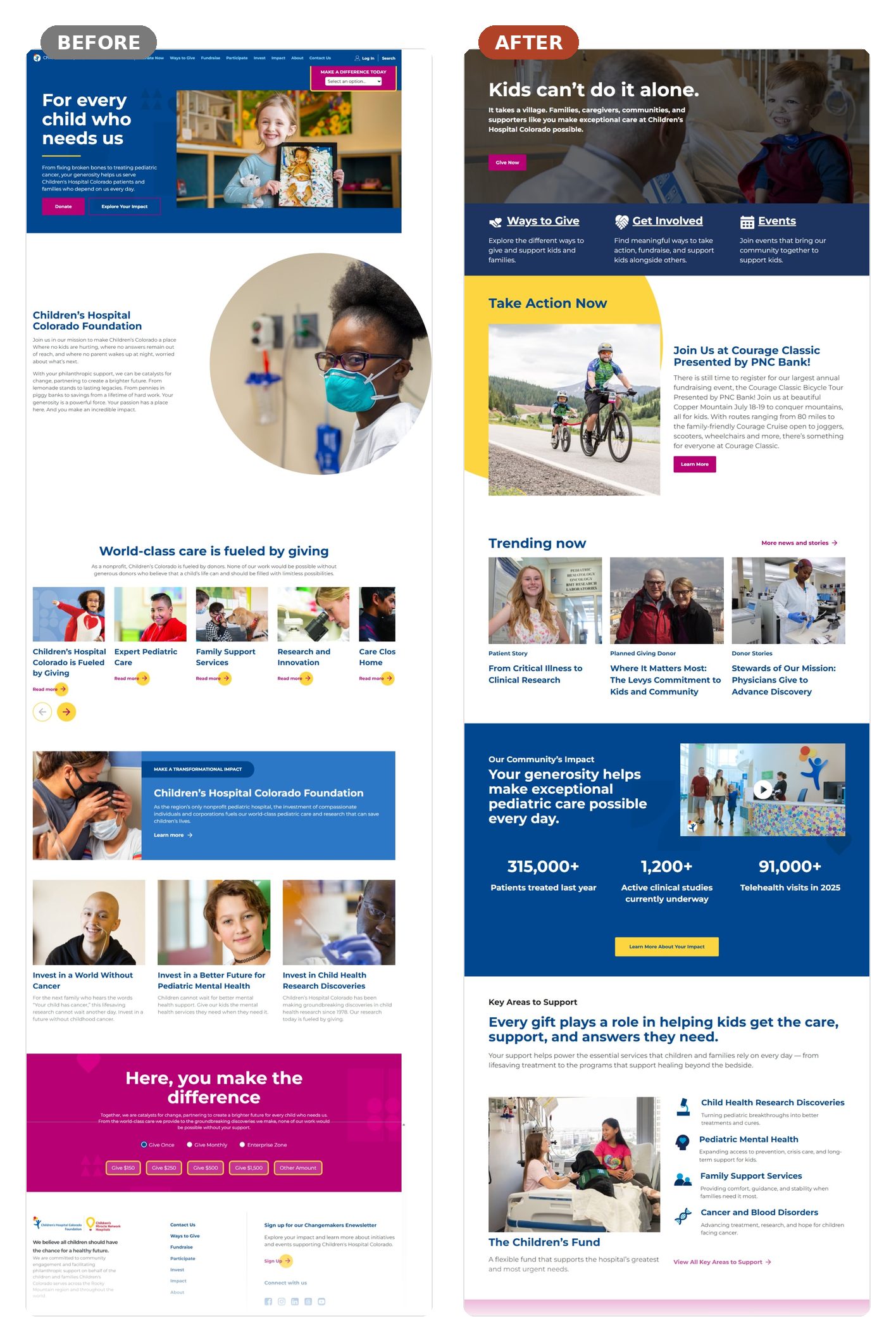
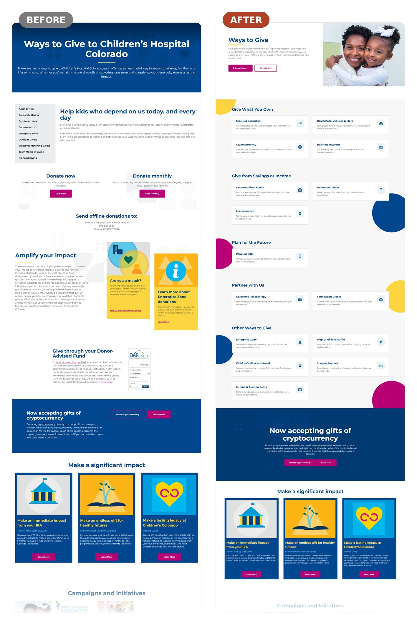
The build touched three connected surfaces. A modernized homepage that surfaces the Foundation’s full breadth from the first screen. A rebuilt global navigation organized around donor intent instead of the org chart, with Ways to Give elevated to a primary destination. And a complete overhaul of the Ways to Give experience itself, reorganized around how donors actually think: give what you own, give from savings or income, plan for the future, partner with us.
03The work
04The results
to reach specific content in user testing, down from 5–6 before the redesign
traffic to Ways to Give pages, 2024 to 2025
growth across event and peer-to-peer fundraising pages
crowdfunding traffic year over year
And the growth wasn’t just traffic. The Foundation saw more event registrations, more noncash asset gifts, and stronger peer-to-peer fundraising traction, exactly the higher-value behaviors the architecture was rebuilt to encourage.
This worked because I directed it as strategy, not a redesign ticket. I brought Foundation leadership into the architecture decisions, and every menu item earned its place against donor intent and fundraising goals. When the structure changed, donor behavior followed.